Accessibility: Colour Contrast

At Savaray we’re highly skilled at finding hidden issues with websites and apps, often, we find issues companies themselves didn’t know they had. Accessibility is one of those broad areas where we’ve found many issues, this article will delve into a small subset of this area, colour contrast.
If you’ve been reading our other articles, you’ll know we alluded to several accessibility issues with the ThorpePark.com home page. We’ll look at some of those here but Thorpe Park is not alone in its inability to follow Web Content Accessibility Guidelines (WCAG) 2.0 guidelines. So we’ll turn our attention to one of Britain’s oldest energy suppliers, British Gas. Before we proceed, let’s all get acquainted with the definition of Colour Contrast.
Colour Contrast, what is it?
Colour contrast is essentially the difference between two colours. In this context we’re referring to WCAG 2.0 standards. WCAG 2.0 AA states that regular text must have a contrast ratio of 4.5:1, larger text must have a at least 3:1. AAA standards are even stricter, requiring regular text to have a contrast ratio of 7:1 and larger text at least 4.5:1. There are further rules such as graphical user interface elements such as input borders having a contrast of 3:1 but I’ll let you read further into the rationale at the WCAG website on rule 1.4.3 (https://www.w3.org/TR/UNDERSTANDING-WCAG20/visual-audio-contrast-contrast.html).
This might seem a little hard to understand at first but let’s look at it visually.
White text on a white background has a contrast of 1:1
White text on a white background
Could you see anything in the text above, no, try highlighting it. There is no difference in the foreground or background hence the ratio of 1:1.
White text on a black background or vice versa has a contrast ratio of 21:1
White text on a black background
I’m sure most of you could see the example text above, there’s an easily discernible difference between the foreground and background.
Then there’s all the colour combinations in between.
Examples of colour contrast issues
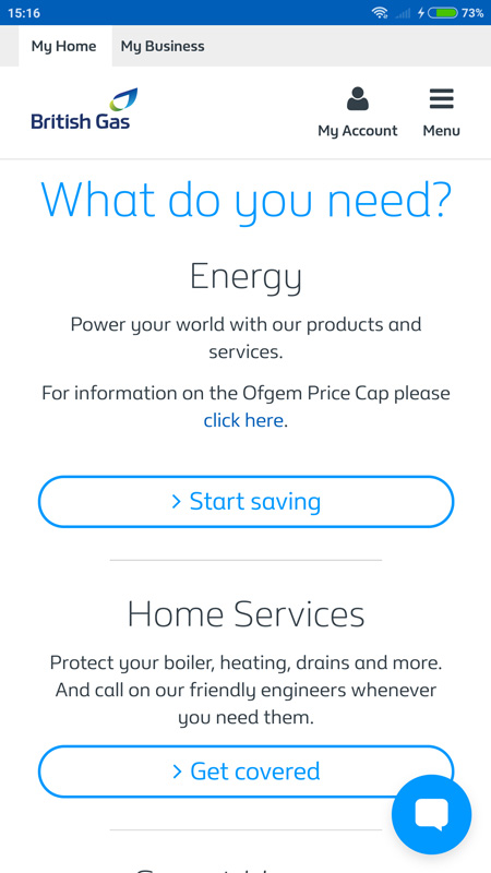
Returning to the British Gas home page, the main text on the page as depicted below is blue, specifically hex code #0099FF. Putting this colour against a white background, as has been done throughout the page, produces a contrast ratio of 3:1. This is a fail for small text and on the border a fail for larger text. Hover states for some elements on the page make backgrounds darker, exacerbating the problem, by further reducing contrast.
Scrolling further down the page we see an input field, with placeholder text. The text is a light grey, specifically hex code #999999, on a white background this results in a contrast ratio of 2.85:1. Again a fail on all WCAG 2.0 AA and AAA requirements. This could easily have been fixed with some smart CSS for placeholder text.
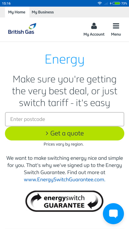
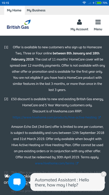
Yes, we also saw the poor CSS spacing on the “Get a quote” button, but those kind of UX issues are a story for another time. These colour contrast issues continue throughout the page till we get to the footer. The footer contains the important links to all the terms and conditions on various offers on the page. It’s a shame then, that an item of such importance is obscured with a contrast ratio of 1.69:1. Barely legible on a background colour of #333F48 and foreground text colour of #005EB8, most definitely an accessibility fail.
Not to worry British Gas you’re not alone, remember Thorpe Park, their page is also full of colour contrast issues. Try reading the names of their rides in the image below:
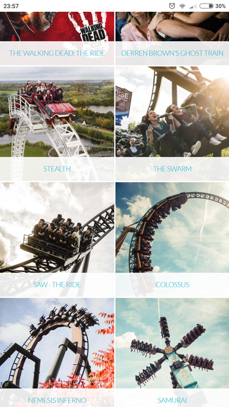
With a foreground text colour of #69C6D7 and a background colour that changes due to opacity, at times as bad as #F3E8E9, results in a very low contrast ratio of 1.64:1. Getting close to our white text on a white background example, especially with that extremely thin text.
Hopefully these examples demonstrate how widespread this problem is.
Note: The brief analysis of the mobile home pages we’re discussing was carried out on the 31st of January 2019 and depicts issues with the websites at that point in time. As software is often updated regularly, if you’re reading this a day, a week or a month after this date, hopefully the issues described would already have been addressed.
Why is colour contrast important
The internet is used by all of us, no two people are the same. We all see colours differently, some have limited vision, others find it difficult to discern colours at all. It is not right to exclude parts of the population from viewing your web pages or apps based on their vision quality. Try your best to improve your digital offering so that it can be viewed by everyone. It might be another item in your backlog, a few more hours in your sprint but it will mean much more to those who can finally see and navigate your pages.
How long does the BritishGas.co.uk take to load?
While we’re here, lets just quickly look at how fast the BritishGas.co.uk page loads.
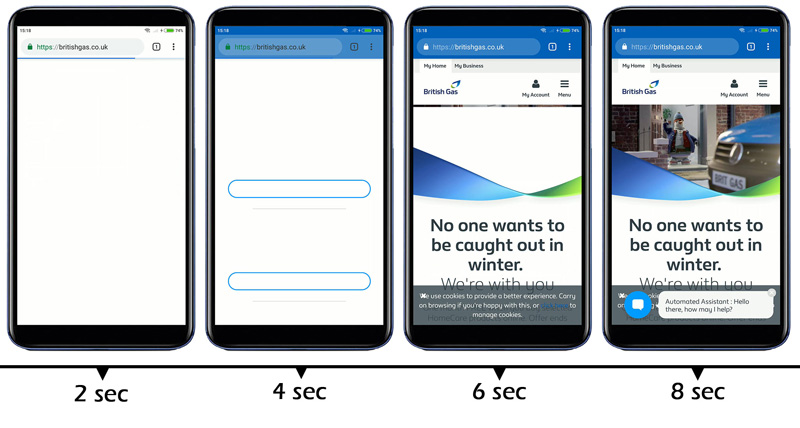
Just over 8 seconds*
*on a 4G connection, with a real Android phone (1080p, Snapdragon 600)
8 seconds to transfer 2.5MB with about 144 requests. This is quite a decent load time in comparison to other large corporate sites of course it could be improved (here’s a hint, multiplexing connections would help). The closer you can get to the magic 3 seconds will significantly reduce bounce rate.
More?
Of course there’s more to know, whilst scrolling through the British Gas homepage we noticed some questionable social media icons, they didn’t quite look like the YouTube, Twitter or Facebook logos. Brand Guidelines seem to have been put to one side here and trademark infringement can be a costly business. Lets pick this up in a future article, in the mean time if you liked what you read please share and if you need help we’re only an email away info(@)savaray.com.
All images depicting the British Gas or Thorpe Park website are not intended to infringe any copyright and are used under fair dealing for criticism and review.
Filed Under: Accessibility
Related Tags: british gas,colour contrast,thorpe park,wcag
